动画与过度?
过度通常要和:hover配合使用 ,无法实现自动播放的功能,总之动画更强大就对了。
动画 animation
制作动画有如下两步:
- 定义动画
- 调用动画
定义动画keyframes
语法:
@keyframes <动画名称> {
0% {

    }
100% {

    }
}
- 0% 动画开始 100% 动画结束,这样规定的就是动画序列
- 可以用百分比来规定发生的时间,或者关键字 form to 和 0% 100% 一样
如下就是个简单的动画:
/* 定义动画 */
@keyframes move {
0% {
transform-origin: 0 0;
transform: scale(1, 1);
}
100% {
transform-origin: 0 0;
transform: scale(2, 1);
}
}
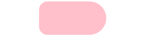
div {
width: 200px;
height: 100px;
margin: 0 auto;
border-radius: 50px 100px 100px 50px;
background-color: pink;
/* 调用动画 */
animation-name: move;
/* 持续时间 */
animation-duration: 1.5s;
}
当然我们这里只定义了两个状态 ,定义四个状态 可以 0% 25% 50% 75% 100% 😄
动画的属性animation
animation: name duration timing-function delay iteration-count direction fill-mode;
-
animation-name
就是我们定义动画名称
-
animation-duration
动画的持续时间
-
animation-timing-function
这个我们一点都不陌生 在过渡
stransition里我们也有这个属性 ,一模一样 默认是easy -
animation-delay
规定了动画延迟
-
animation-iteration-count
动画的重复次数,默认就是1 ,如果想无限循环那就设置为
infinite -
animation-direction
是否逆向播放,默认值为
normal,如果想逆向播放,那就设置为alternate对比一下上面的情况。突然感觉好奇怪QWQ(我改小了时间)

-
fill-mode
规定动画的结束后的状态,默认值是
backwards回到起始状态可以设置
forwars停止到结束状态 -
animation-play-state
可以规定动画是否播放
paused暂停播放,默认是running播放
如何简写
书写顺序: animation: 动画名称 持续时间 运动曲线 何时开始 播放次数 是否反方向 结束状态;
前两个属性不可省略,后面的可以缺省。
练习
实现如下波纹动画:
想法: 圆盒子外面套三个盒子,做一个动画增加外面三个盒子的半径,水波纹效果使用阴影最佳。然后重点来了 ——让外面的三个盒子有延迟,就会实现这个水波的效果了。为了外面的盒子与中心的点的盒子做动画的时候中心对齐,使用如下方法:
            position: absolute;
            top: 50%;
            left: 50%;
            transform: translate(-50%, -50%);

代码如下:
    <style>
        * {
            margin: 0;
            padding: 0;
        }

        .box {
            position: absolute;
            top: 50%;
            margin-top: -50px;
            left: 50%;
            margin-left: -50px;
            width: 100px;
            height: 100px;
            border: 1px solid #cccccc;
            box-sizing: border-box;
        }

        .dotted {
            position: absolute;
            width: 8px;
            height: 8px;
            top: 50%;
            margin-top: -4px;
            left: 50%;
            margin-left: -4px;
            border-radius: 50%;
            background-color: #09f;

        }

        .box div[class^=pulse] {
            position: absolute;
            top: 50%;
            left: 50%;
            transform: translate(-50%, -50%);
            /* 以上代码保证我的盒子不管放大都是保持这垂直水平居中 */
            width: 8px;
            height: 8px;
            box-shadow: 0 0 12px #009dfd;
            border-radius: 50%;
            /* linear 匀速 */
            animation: pulse 1.2s linear infinite;
        }

        .pulse2 {
            animation-delay: 0.4s !important;

        }

        .pulse3 {
            animation-delay: 0.8s !important;
        }

        @keyframes pulse {
            0% {}

            70% {
                width: 45px;
                height: 45px;
                opacity: 1;
                /*透明度*/
            }

            100% {
                width: 66px;
                height: 66px;
                opacity: 0;
                /*透明度*/
            }

        }
    </style>

<body>
    <div class="box">
        <div class="dotted">
            <div class="pulse1"></div>
            <div class="pulse2"></div>
            <div class="pulse3"></div>
        </div>
    </div>
</body>
结语
放假咸鱼的第14天